WordPress 3.8 Releas...
WordPress 3.8 Released
WordPress 3.8 Released
WordPress 3.8 released
WordPress 3.8 has been released today and includes a large number of significant changes from 170 contributors with Matt Mullenweg as the release lead. This version is now the second that contains new functionality that was initially developed as a plugin before being brought into the core product. This approach leads to much shorter time frame between major releases with the ability to include considerably more functionality in each release – 3.8 is proof that this is working.
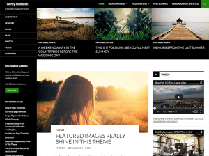
A New Default Theme TwentyFourteen
The new default theme is targeted at magazine-style sites and there is a choice between using a grid or a slider to display featured content on the homepage. The site can then be customised using three widget areas or layout can be changed using two page templates – a full width page template and a template to highlight your contributing authors.
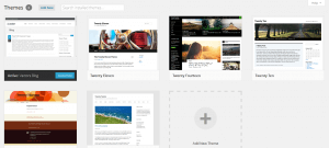
New Theme Management Screen and Streamlined Widgets
This functionality was originally developed as a plugin called THX and allows you to easily view your themes at a glance – a simple click gives you a large screenshot as well more detailed information on the right hand side. It is very easy to browse through every theme you’ve got installed and with larger thumbnails it is even easier to see what each looks like.
Widget management can often be complicated but the new design makes this much easier and caters for different screen sizes and designs. On a large monitor multiple widget areas make great use of the available space and if you are using a tablet you can simply tap a widget to add it.
New Admin Design
This is probably the most striking change in WP 3.8 and certainly the first you see after upgrading ! If the dark colour scheme that is now the default is not to your taste, then there are eight different colour schemes to choose from and who knows what could be added in the future. The new designs are bold but at the same time fresh and uncluttered and with better contrast and a different typeface (Open Sans), the result is an admin area that is easy to use on large desktop screens and tablets or mobile devices.
With the increased use of tablets and other mobile devices a very welcome change is that WordPress is now responsive with the use of vector images ensuring the images scale to the screen and are much quicker to load
Overall, this is a fantastic set of new features and we recommend you to upgrade and take advantage of them !


